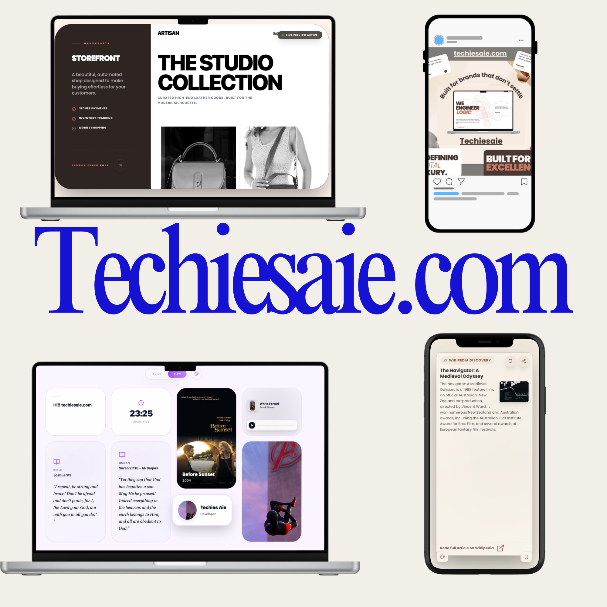
Launching your startup website feels like a big milestone. You finally have something live. Something real. You send it to friends, post it on social media, maybe even run ads. And then… nothing really happens.
Visitors come. They look around. They leave.
This is where many founders get frustrated. They think they need more traffic, more features, more design, or a full redesign. But most of the time, the real problem is much simpler: the website isn’t built to convert. It’s built to exist.
A converting website doesn’t try to impress everyone. It speaks clearly to one specific person. When someone lands on your homepage, they should instantly understand three things: what you do, who it’s for, and why it matters. If that isn’t obvious within the first few seconds, people leave — not because your idea is bad, but because it’s unclear.
Another common issue is focusing too much on aesthetics and not enough on direction. Yes, design matters. Clean visuals build trust. But a beautiful website without structure is like a well-decorated store with no signs telling you where to go. Every page should guide visitors toward one clear action. Sign up. Book a call. Start a free trial. Buy now. If you’re asking them to do five different things, they’ll probably do none.
Trust is another silent factor. Startups often forget that visitors don’t know them yet. Why should someone trust you with their time, email, or money? Simple elements like testimonials, clear messaging, real photos, transparent pricing, and straightforward language make a huge difference. People don’t buy from websites. They buy from brands they trust.
Speed and simplicity also matter more than most founders realize. If your website takes too long to load or feels confusing to navigate, visitors won’t stay long enough to understand your value. In today’s world, attention is short. Your message must be clear, your layout intuitive, and your experience smooth — especially on mobile.
And here’s something important: conversion isn’t manipulation. It’s clarity. It’s removing friction. It’s helping people make a confident decision. When your website clearly explains the problem, presents the solution, and guides users naturally to the next step, conversion becomes easier.
You don’t need a complicated system. You need alignment between your idea, your audience, and your message. When those three are clear, your website stops being a digital brochure and starts becoming a growth tool.
If your startup website isn’t converting yet, it doesn’t mean your idea is wrong. It might just mean your message needs to be clearer.